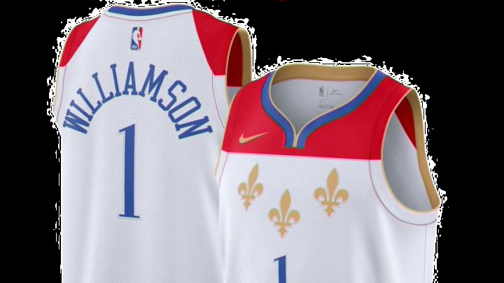
New Orleans Pelicans: Ranking the city edition jerseys #6-4
6. Charlotte Hornets – 14 points
https://twitter.com/hornets/status/1326661245970362369?ref_src=twsrc%5Etfw%7Ctwcamp%5Etweetembed%7Ctwterm%5E1326661245970362369%7Ctwgr%5E%7Ctwcon%5Es1_&ref_url=https%3A%2F%2Fwww.sportingnews.com%2Fau%2Fnba%2Fnews%2Fteams-unveil-new-uniforms-for-2020-21-nba-season-association-icon-statement-city-classic-editions%2Fc4unkryil06a1gv6bfwf7owee
Pop – 8, Difference – 1 point, Story – 2 points, Colors – 3
This is how you make a good impression, the Hornets are just blowing the doors off with these. Designed to celebrate the first U.S. Branch Mint and Carolina Gold Rush, the team really does a good job by simply taking things that are also colors and building a uniform around that concept. Throw in the cities color, granite, and you’ve got the recipe for a stylish jersey that will sell like crazy (this is really why they signed Gordon Hayward).
What’s holding the City Editions back from reaching the tippy-top is Charolette’s other jerseys, they’re just too close to this. Not to say those main jerseys aren’t incredible (top three in NBA and yes I miss those stripes) but these just aren’t different enough from the regular more used version
5. Miami Heat – 14 points
Fit for the future.
— Miami HEAT (@MiamiHEAT) December 1, 2020
Preorder your #ViceVersa jersey Wednesday night at Midnight.
@MiamiHEAT // @AmericanAir pic.twitter.com/WnWETPe7qH
Pop – 7 points, Difference – 3 points, Story – 1 point, Colors – 3 points.
The last of the “Vice” jerseys, this one is stylistically similar to all the others but it’s pretty much a combination of the last two. The pink to blue horizontal gradient is an interesting look but the colors fit Miami perfectly (probably why they’ve used them already).
When the City Edition leaks started to trickle out online, Miami was highest on my list of jerseys I was looking excited to see. This one however fell a little flat. If it was a verticle gradient I think this jersey would have been even closer to the top of the list than it landed.
4. Memphis Grizzlies – 14 points
https://twitter.com/memgrizz/status/1331339183345053699
Pop – 6 points, Difference – 3 points, Story – 3 points, Colors – 2 points.
Meant to honor the rich history of music in the city as well as the legacy of Stax Records and the life of Issac Hayes. Not that folks, is how you come up with a strong starting point when creating a jersey. Memphis like every NBA city has tons of history to choose from and instead of going with a general idea the Grizzlies picked a couple of very specific pieces of city history and built around that.
The lines on the jersey are meant to symbolize the grooves in a record. That is the kind of detail that gets you high up the list. But to then pair that with the side panel which was inspired by Hayes’ fashion you create a top four jersey for this season. The only that that holds these back is the font and number choice, I’d like to see something related to the rest of the jersey in that department.
