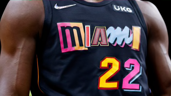
Another year of NBA basketball means another opportunity for Nike to come out with fresh NBA city edition jerseys. Unfortunately, the Pels have struck out once again.
The NBA City Edition jerseys from Nike are an opportunity to create a different look for teams to wear every now and then during the season. This year, Nike created jerseys to represent each team’s history as a part of the NBA’s 75th anniversary.
This could have been the opportunity to invoke memories from the 2007-08 season or even way back to when the Jazz were still in New Orleans. Instead, Nike created a jersey that was “inspired by the resilience of the city” and uses cues from the wrought iron fencing around town to design the font (I won’t even waste time discussing the release video).
Showing love to NOLA 🤩
— New Orleans Pelicans (@PelicansNBA) November 1, 2021
Introducing your 2021-22 City Edition jerseys 🔥 pic.twitter.com/62H5LSQo5h
To me, it just doesn’t work. Not for a special jersey like the city editions are supposed to be. This is another missed opportunity for the Pels to create something really special that fans could get behind.
So did Nike miss the mark with other teams as well? I set out to grade each team based on three criteria. Each criterion has a point scale on which it will be graded, with the highest score being 16 points.
How the NBA city edition jerseys were ranked
Pop Factor (1-10 points) – Think of this as a first glance test. Did each jersey stand out the first time I saw it?
Difference Factor (1-3 points) – To me, these jerseys shouldn’t be too similar to a teams’ regular jerseys.
Color Factor (1-3 points) – This is related to the difference factor, in that I’d like to see a team either use colors that aren’t a part of their everyday looks. Or at least switching up how their regular colors are used.
After looking at each of the NBA city edition jerseys individually, this year was somewhat disappointing to me. No team really knocked it out of the park and a fair amount went with basically a throwback jersey. That being said only a few teams were just bad in my mind. This year had a high floor-low ceiling feel with a lot of teams bunched up near the middle.
One note, I did not include shorts in this ranking because there are some attrocious shorts this year. For your on sake do not go looking for them.
You can see all of the NBA city edition jerseys here.
Now onto the rankings.
