Ranking NBA city edition jerseys: 30-21
30. Boston Celtics – 4 points
Boston fans must love their team’s traditional looks or else the team wouldn’t keep up with slight changes to old uniforms. This is one of those NBA city edition jerseys that feels like you pulled something out of the very back of your closet and since you haven’t worn it in a while, thought you’d take it for a spin. This jersey is supposed to look back on teams from the late 1940s but a bigger swing could’ve been taken.
Pop (2) Difference (1) Colors (1).
29. Utah Jazz – 4 points
I know what you’re thinking, “That’s a nice jersey. How can it be scored so low?” Well, it is a nice jersey that I won’t dispute. It’s just I liked it a helluva lot more last year when they debuted it. This is just a retread and not the City Edition I would’ve chosen to recycle.
Pop (2) Difference (1) Colors (1).
28. Phoenix Suns – 5 points
Another jersey that was identical to last year’s. I can’t blame Phoenix for going this route, these jerseys are really cool and one of the biggest moments from last year’s Finals run came in these threads. I like the jersey but reuse doesn’t rate highly here.
Pop (3) Difference (1) Colors (1)
27. New Orleans Pelicans – 5.5 points
The jersey itself isn’t that bad and I’d rather they wear these than the current home whites. This just could’ve been something really cool that brought back some good memories for fans at a time when it feels like a cloud is just hanging over the fanbase. Change up the striping on the side and these could be really nice.
The good news is it is better than last year’s, which were awful.
Pop (3) Difference (1.5) Colors (1)
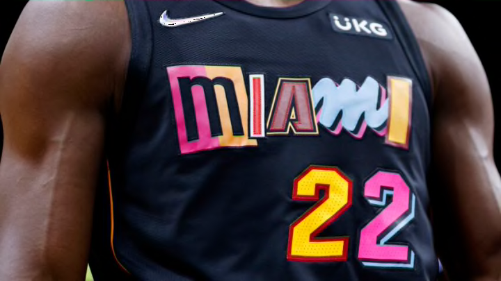
26. Miami Heat – 6 points
Oh how the mighty have fallen. The Heat were long the standard of the City Edition jerseys but their hold on the crown started getting loose last year and now they’ve dropped it completely. The idea behind this jersey is actually pretty cool with the mashup of letters to pick from jerseys of the past. All together it just doesn’t work for me. This jersey is so Miami that even the shorts have velvet ropes.
Pop (3) Difference (1.5) Colors (1.5)
25. Memphis Grizzlies – 6 points
Last year the Grizzlies were near the top of the league when it came to the City Editions. It’s hard to stay near the top in anything. These look like a regular third jersey and not something to commemorate a special anniversary. It’s a solid look but not inspiring.
Pop (4) Difference (1) Colors (1)
24. Portland Trail Blazers – 6.5 points
This is another jersey that feels very third kit to me. I like that the team went with the “Rip City” name, just a cool nickname to me. But it does feel like something the Blazers have already worn but not a throwback. Give it to me in red with black letters and this thing would pop big time.
Pop (4) Difference (1.5) Colors (1)
23. Indianapolis Pacers – 7 points
Let me start off by saying I do NOT like the stripes on the front. It feels like a cross between their jerseys of the 80s and 90s but in a bizarro world kind of way. It makes sense that Indy would go for a mashup throwback look for the 75th anniversary, this one just stumbled out of the gates with the stripes and couldn’t recover.
Pop (4) Difference (2) Colors (1)
22. Dallas Mavericks – 8.5 points
All aboard the Dallas needs a rebrand train. This jersey combines the only two looks the team has every really had. The stripes down the side and font are from the current jerseys but the colors and logo are from the past. Add the two together and you get something that is a little better than the regular white jerseys for Dallas but still lagging behind in this competition.
Pop (5) Difference (2.5) Colors (1)
21. Sacramento Kings – 9 points
I like the black jersey for Sacramento, they haven’t had a full time black jersey since 2002. And the script font is a very nice attempt but I’d tweak it slightly, lose the tail at the top of the S and this thing would be rocking. I wish more teams would attempt a scripted lettering across the front but it seems like basketball as a whole is content to stick with block letters.
Pop (6) Difference (2) Colors (1)
