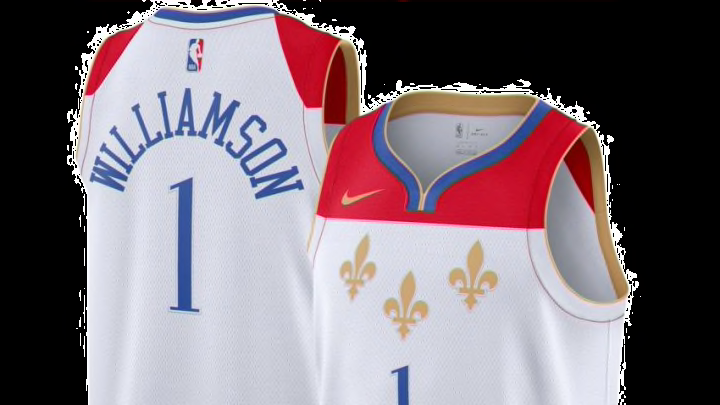
New Orleans Pelicans: Ranking the NBA’s city edition uniforms
By Tim Burke

New Orleans Pelicans: Ranking the city edition jerseys #30-28
30. Detroit Pistons – 5 points
A motor that won't quit. pic.twitter.com/CqujFPHfZu
— Detroit Pistons (@DetroitPistons) November 20, 2020
Pop – 2 points, Difference – 1 point, Story – 1 point, Colors – 1 point.
Now that we’re looking at real teams we start to see the stinkers. This is just very boring and not too different from the normal jersey. At first look, I was intrigued by the circle logo but that’s about it, the colors are used in the same way as other jerseys. This and the Icon jersey are too similar that there’s no point in doing both.
This will come up a few other times in this ranking but I don’t understand why teams need to honor something that’s already honored with the teams’ name. The Pistons part of the team name is for the cities car building history, so why go the safe easy route with this jersey. There are plenty of other things the team can rise from Detroit’s past to base a jersey on. The teams that score highly do just that.
Like the New Orleans Pelicans, the Pistons need to draw on some of the most interesting parts of the city’s culture.
29. Washington Wizards – 6 points
https://twitter.com/NBASTORE/status/1334561789531533312?ref_src=twsrc%5Etfw%7Ctwcamp%5Etweetembed%7Ctwterm%5E1334561789531533312%7Ctwgr%5E%7Ctwcon%5Es1_&ref_url=https%3A%2F%2Fbleacherreport.com%2Farticles%2F2920896-ranking-every-nba-teams-2021-city-edition-jersey
Pop – 1 point, Difference – 3 points, Story – 1 point, Colors – 1 point.
I get what they were going for but these look more like a 4th of July tank top than an NBA jersey. The stars and stripes down the side are a nice touch. There just isn’t much to say about these.
The Wizards are a team that I’d love to see get radical and do a full rebrand but we all know that won’t happen anytime soon.
28. Boston Celtics – 6 points
From the rafters to the parquet, it’s all about #TheBanner. pic.twitter.com/YVwvba5U1j
— Boston Celtics (@celtics) November 20, 2020
Pop – 2 points, Difference – 1 point, Story – 2 points, Colors – 1 point
Meant to look like the Championship banners that hang in the rafters. I get what they were going for but it leaves me wanting more. They just aren’t that different from the normal Celtics jerseys and they lose points for that.
I’d give these a zero for color factor if I could but they still get the lowest possible score. Boston has tons of tradition and wants to stay true to that identity but they could’ve honored their past while incorporating more of the cities identity into these.