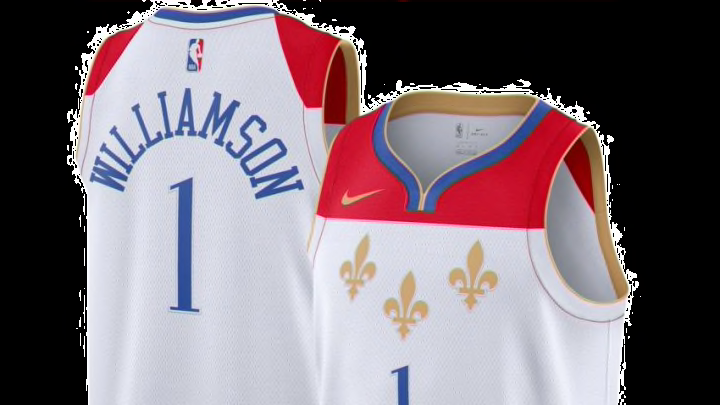
New Orleans Pelicans: Ranking the NBA’s city edition uniforms
By Tim Burke

New Orleans Pelicans: Ranking the city edition jerseys #27-25
27. New York Knicks – 6 points
https://twitter.com/DailyKnicksFS/status/1322379888100286464?ref_src=twsrc%5Etfw%7Ctwcamp%5Etweetembed%7Ctwterm%5E1322379888100286464%7Ctwgr%5E%7Ctwcon%5Es1_&ref_url=https%3A%2F%2Fdailyknicks.com%2F2020%2F10%2F31%2Fknicks-city-edition-jerseys-possibly-leaked%2F
Pop – 2 points, Difference – 2 points, Story – 1 point, Colors – 1 point.
Nothing to really write home about on these and they haven’t been officially confirmed so the internet is just speculating that these will be the Knicks City jerseys this season. Look they’re not the worst in the NBA but it’s close.
The circle logo is a good idea but there needs to be a better delineation between the team name and slogan, this reads as “City never sleeps New York Knicks” just dumb. The black jersey isn’t bad but there’s so much more the Knicks could do here.
26. Cleveland Cavaliers – 7 points.
https://twitter.com/cavs/status/1334505169749504002?ref_src=twsrc%5Etfw%7Ctwcamp%5Etweetembed%7Ctwterm%5E1334505169749504002%7Ctwgr%5E%7Ctwcon%5Es1_&ref_url=https%3A%2F%2Fwww.sportingnews.com%2Fau%2Fnba%2Fnews%2Fteams-unveil-new-uniforms-for-2020-21-nba-season-association-icon-statement-city-classic-editions%2Fc4unkryil06a1gv6bfwf7owee
Pop – 2 points, Difference – 2 points, Story – 2 points, Colors – 1 point.
Cleveland is honoring the cities rock and roll past. This is a really cool starting point for a jersey but I feel like more could have been done here. The jersey just doesn’t seem very rock and roll to me, instead, it’s a safe version of that. By changing the font you get a little feeling of what the creators really wanted to do before it had to be dialed back into something more suitable for the widespread public.
I like the color scheme but it’s not very different from the teams’ normal colors. In the end, this could have been one of the best jerseys as the team had decades of rule breakers to work with but chose to play it safe as not to offend anyone.
These are even worse than the New Orleans Pelicans.
25. Indiana Pacers – 8 points
https://twitter.com/Pacers/status/1334189969179602951?ref_src=twsrc%5Etfw%7Ctwcamp%5Etweetembed%7Ctwterm%5E1334189969179602951%7Ctwgr%5E%7Ctwcon%5Es1_&ref_url=https%3A%2F%2Fwww.sportingnews.com%2Fau%2Fnba%2Fnews%2Fteams-unveil-new-uniforms-for-2020-21-nba-season-association-icon-statement-city-classic-editions%2Fc4unkryil06a1gv6bfwf7owee
Pop – 4 points, Difference – 2 points, Story – 1 point, Colors – 1 point.
I like these but this is just a throwback jersey, not a new one. That doesn’t mean they aren’t good because these very much are but this jersey has basically been for sale for years now.
The logo on the waistband is really cool, would be nice to see this featured more heavily in the next couple of years. The team says they’re using the inspiration of Indianapolis’ city color, royal blue, to me that’s closer to navy than it is royal. If these are in fact much lighter in person they will look very good on the court.